kaioshin, will it be possible to have the whole "circle mana plate" visible? so that it will look like it's floating/hovering the plane...kaioshin wrote:That would be awesome! Don't know if it's possible, though, since it would need some recoding. That's not my buisnessflad_nag wrote: The mana symbols on the board would probably address the issue of dynamic mana readability that also affects psp performance. my proposal is to have an option of a static mana readability. The mana symbols on the board will light up and a number will appear how many mana has been activated. For a generic mana, the number will appear in the middle of the circle. See attached file as an example..
Anyway, quick update on the "official" one:
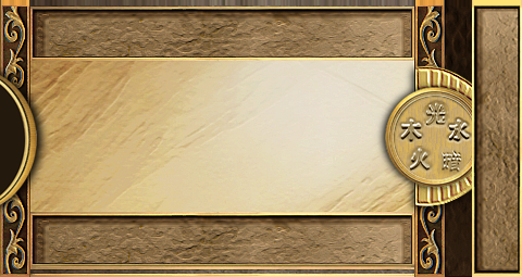
I'll just replace the current mana symbols with the Wagic symbols and make some kinda gold frame like in the "unofficial" one.
My battlefield GUI
Re: My battlefield GUI
Re: My battlefield GUI
i guess, if the dev team will pursue this then the big card will just have to cover the mana plane during playwololo wrote:I like this idea but I need to convince a few people before it gets done. But if we put mana that way (even as an option), where/How do we display the big card ?
do you have any idea guys?
Re: My battlefield GUI
That really is a problem. So maybe the mana circle is just decoration...
edit: oh, and here's one hovering mana-circle. Thank god for layers in photoshop .
.
edit: oh, and here's one hovering mana-circle. Thank god for layers in photoshop
Re: My battlefield GUI
Hmmm, I don't really see the point of having this huge mana circle in the middle of the screen if it's just for decoration... it reduces the game area a lot, which will look awkward when cards start to go on the right of the screen.
I understand you need some kind of "round" shape to balance the void half circle on the left (for the phases), but how about half a circle there as well, then ?
The second version (the "hovering" one) definitely takes too much useful space for my tastes. I like the first one though, I just feel sad that the big card is just on top of that... I need to think and discuss it with the others...
Here's what I have in mind:
We go with this image:
the big card is always on top of the mana circle, but IF the "static mana display" option is on (this option does not exist yet) AND there is mana in the manapool, THEN the big card shifts a little bit on the left to let the player see the static manapool...
Re: My battlefield GUI
can you please make 2 more versions:
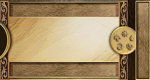
1- one with the copyrighted symbols, with hovering circle mana plate, without the inverted C-like design on the right side of the mana plate
2- the same as item 1 above but with the wagic symbols
p.s. --> please move the circle mana plate to the right (so that it is just 2 to 3 hairlines away from the left edge of the rightmost vertical bar)

thanks!
1- one with the copyrighted symbols, with hovering circle mana plate, without the inverted C-like design on the right side of the mana plate
2- the same as item 1 above but with the wagic symbols
p.s. --> please move the circle mana plate to the right (so that it is just 2 to 3 hairlines away from the left edge of the rightmost vertical bar)
thanks!
Re: My battlefield GUI
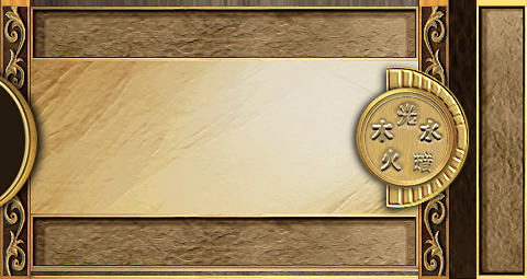
i think we can go with the design pointed out by wololo. But for my taste, I would remove the inverted C-like design and still make the 'circle mana plate' hover above the rightmost vertical bar (but not moving its position to the left so as not to occupy more middle space). So a small portion of the plate is overlapping the rightmost veritical bar.wololo wrote:Hmmm, I don't really see the point of having this huge mana circle in the middle of the screen if it's just for decoration... it reduces the game area a lot, which will look awkward when cards start to go on the right of the screen.
I understand you need some kind of "round" shape to balance the void half circle on the left (for the phases), but how about half a circle there as well, then ?
The second version (the "hovering" one) definitely takes too much useful space for my tastes. I like the first one though, I just feel sad that the big card is just on top of that... I need to think and discuss it with the others...
Here's what I have in mind:
We go with this image:
the big card is always on top of the mana circle, but IF the "static mana display" option is on (this option does not exist yet) AND there is mana in the manapool, THEN the big card shifts a little bit on the left to let the player see the static manapool...
Or probably, we can make the mana plate to the smallest (and reasonable) possible size, just enough to inform the player of how many mana he has already activated (so that viewing the big card will not be so much affected) - and that the number text on the mana plate will still be readable.
EDIT: How about removing the black portion near the rightmost vertical bar by stretching the grass-like design all the way to the right (just a thought).
Last edited by flad_nag on Tue Sep 29, 2009 4:09 pm, edited 1 time in total.
Re: My battlefield GUI
The battlefiled stops before the grass-like bar, so imho there's no need to recalibrate it:
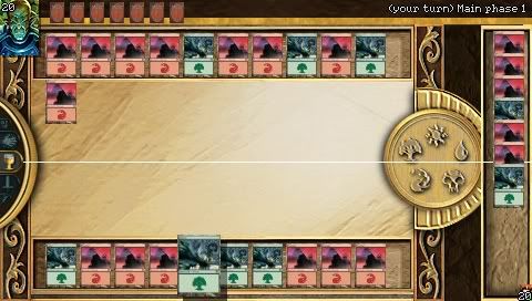
I redid a few things, so now the enlarged hand gui is fitting the design:
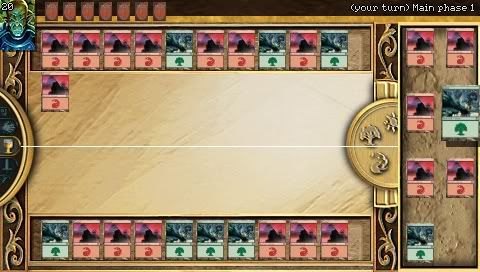
Of course I could also remove the C-like design, but imho the mana coin looks a bit lost this way. If the mana coin is causing to much trouble, I have no problem with removing it at all.
I redid a few things, so now the enlarged hand gui is fitting the design:
Of course I could also remove the C-like design, but imho the mana coin looks a bit lost this way. If the mana coin is causing to much trouble, I have no problem with removing it at all.
Re: My battlefield GUI
This will change very soonkaioshin wrote:The battlefiled stops before the grass-like bar, so imho there's no need to recalibrate it:
Edit: also give a try to the "horizontal hand" mode in the options (yes, we like to create nightmares for the designers)
Re: My battlefield GUI
hi kaioshin, i think i am now agreeing to what you are saying. i'm now ok with this. good job.kaioshin wrote:The battlefiled stops before the grass-like bar, so imho there's no need to recalibrate it:
I redid a few things, so now the enlarged hand gui is fitting the design:
Of course I could also remove the C-like design, but imho the mana coin looks a bit lost this way. If the mana coin is causing to much trouble, I have no problem with removing it at all.